Media queries are declared using the @ media
directive in conjunction with conditional media features. The following syntax
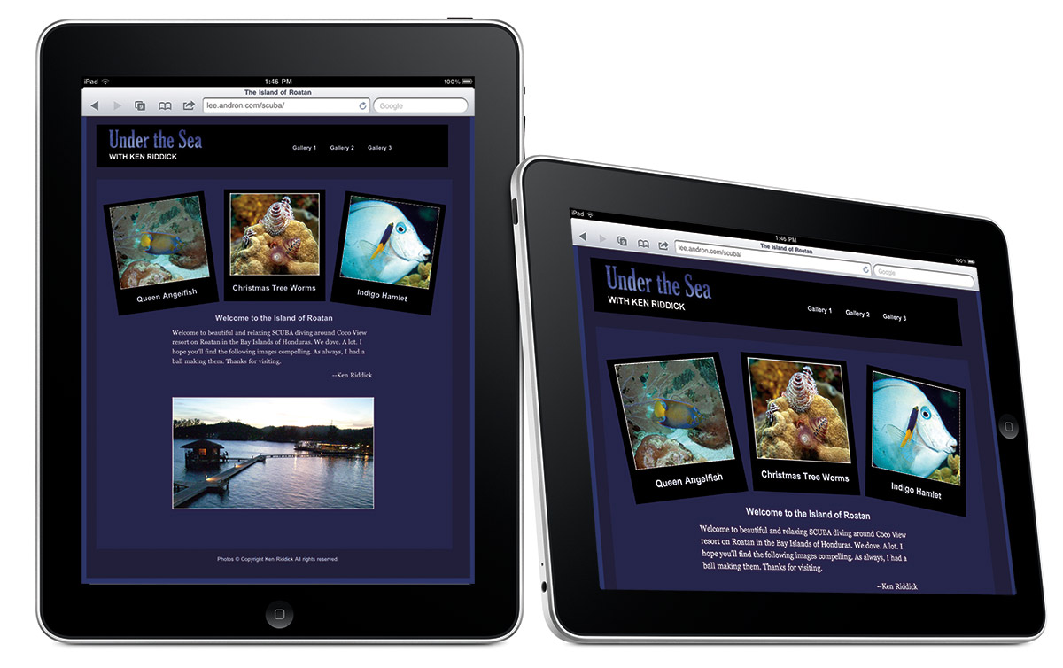
targets the iPad in both landscape and portrait mode:
@media only screen
and (min-device-width: 768px)
and (max-device-width: 1024px) {
/* selectors and styles go here
*/
}
If you want to target iPad in landscape mode alone, you
would do this:
@media only screen
and (min-device-width: 768px)
and (max-device-width: 1024px)
and (orientation: landscape) {
/* selectors and styles go
here */
}
And to target the iPad in portrait mode:
@media only screen
and (min-device-width: 768px)
and (max-device-width: 1024px)
and (orientation : portrait) {
/* selectors and styles go
here */
}
This is just a small sample of the lexibility of media
queries


 Posts
Posts

